|
|
Orit
Aug 11, 2015 18:55:14 GMT -6
Post by Elk on Aug 11, 2015 18:55:14 GMT -6
Alright everyone! Let's get started! Updated Orit! c: Tried to incorporate all of your feedback, retaining the general pose but thinner linework and amending the wing structure. Aimed to mix predatory bird features with the natural anatomy of the woodpecker - and took some artistic liberty in giving him a little more prominent fluff crest for character. 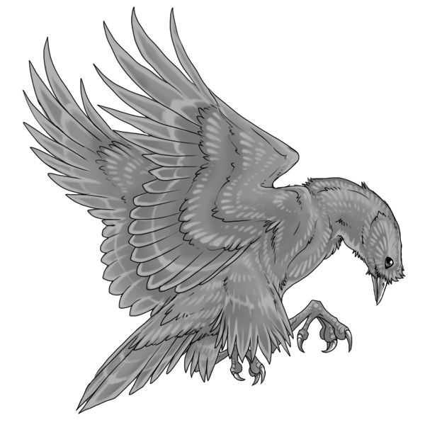 From demo: 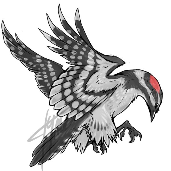 Also, Elk - would you prefer I start a new board for posting final and WIP bases, or even separate boards for each species? How would you like to organize progress updates, feedback, etc? (Tyme, you can post new threads within this subcategory for the remaining birds. I only wanted to organize the board before adding this thread.) |
|
|
|
Orit
Aug 12, 2015 12:11:28 GMT -6
Post by Elk on Aug 12, 2015 12:11:28 GMT -6
So first thoughts, I'm in love. It looks amazing!!! I'm really, really, really liking this. Second look, I noticed a few small things that wouldn't leave my head. Sorry. :c (see image below) Third set of thoughts: I still love it. It still looks amazing and oh my gosh I can't wait until we can use this in the context of a running site! <3  |
|
|
|
Orit
Aug 12, 2015 18:17:59 GMT -6
Post by wynterrose on Aug 12, 2015 18:17:59 GMT -6
Well, first, that face. It is adorable! I love how the fluff looks when it goes over the beak. The eye is so innocent yet it looks like it likes to play around. The highlights make it look very artsy with glossy feathers, and I can see it being fun to play with markings to show off the highlights, possibly making it look metal <3
There are a few notes I'd like to point out. I agree with Elk, feather with the inconsistent line strength suddenly breaks into a thinner lineart then returned to normal. There are some wobbly lines, but they aren't terrible. I use a laptop, so when I make lineart I have to use a stabilizer or smooth stroke. I have it cranked up high but maybe using the feature at, say, 15 for amount would help smooth it out so you wouldn't have to spend hours trying to get it just right, since I know how hard and stressful that can be. I think you should focus on the claws. Looking a it, I have no idea if the closest claw has 3 or 4 talons, and if it has 4 then the farthest one appears to only have 3. Also the back talon of the farthest claw has a larger, um, "bump" right above the actual talon. I don't know what it's called, but for consistency's sake it should be more blocky and smaller, like the hind talon on the closest claw.
Other than those minor notes, the bird looks amazing! You're very talented and I look forward to seeing the other avians drawn by you!
|
|
|
|
Orit
Aug 12, 2015 22:02:29 GMT -6
Post by armadillosushi on Aug 12, 2015 22:02:29 GMT -6
Love it, love it, love it! It has all the good parts of the first version as well as the advantages of not being rushed/having feedback/magic? Other than the shaky lines on the feathers in a couple places, like you mentioned, Elk, and the left foot missing a talon maybe, it seems quite site-worthy. Definitely a good artist choice! c:
|
|
|
|
Orit
Aug 21, 2015 14:51:34 GMT -6
Post by runeowl on Aug 21, 2015 14:51:34 GMT -6
This looks really great!  Just one thing - is there going to be additional shading/highlights? There's some really lovely feather texture and small highlights (that I love btw) but the image overall lays flat. |
|
|
|
Orit
Aug 21, 2015 21:52:44 GMT -6
Post by Elk on Aug 21, 2015 21:52:44 GMT -6
Someone on Gryffs was saying how they did their wings wrong and someone else went and posted a link on how to correct it. And then I realized we should count how many feathers each wing has. Both wings should have the same number of feathers.
I might have miscounted, but my count for the far wing's primaries is 9. My count for the close wing's primaries is 7. The secondaries are difficult because you can't see all of the far wing's secondaries, so I'm not worried about those. They look close enough.
In doing this though I also noticed that the far wing's top feather is significantly shorter in relation to the one below it than the close wing's top feather is. I don't know how I didn't realize that before now.
|
|
Tyme
New Member

Posts: 4 
|
Orit
Aug 23, 2015 9:25:15 GMT -6
Post by Tyme on Aug 23, 2015 9:25:15 GMT -6
I should have double checked the forum before reworking this version, but here's the new update. Looks like you might want some new things changed though. 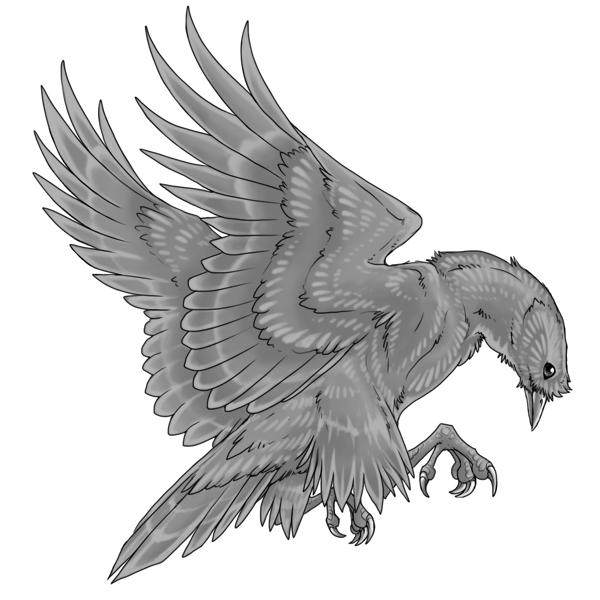 |
|
|
|
Orit
Aug 27, 2015 0:08:16 GMT -6
Post by armadillosushi on Aug 27, 2015 0:08:16 GMT -6
Beautiful! The highlighting looks better that way as well. I don't think anyone will be counting primary/secondary feathers, so we should make sure to check that in later species but I think at this point it wouldn't improve the art that much to add the extra feathers.
|
|
|
|
Orit
Aug 27, 2015 0:37:18 GMT -6
Post by Elk on Aug 27, 2015 0:37:18 GMT -6
I agree with Sooshi in that it looks amazing! I love the revisions you made on it.
That said I do think it is a big enough deal that we add the two missing feathers to the front wing. A noticeable number of people who play sites like this online have anxiety disorders, one of which is OCD. It's important that we make the site with others in mind, and that includes those who could be induced into an anxiety attack by something like this.
Another point is consistency: people do count things like feathers. It's the nature of the beast. Someone will do it. And when they notice that the feathers are uneven on this bird but not on the others they're going to wonder why that is.
And it just makes a difference when you're looking at it. The back wing looks full and beautiful. The front wing looks smaller on top (rightfully so because it is; it's missing two entire feathers).
If those middle feathers are changed into primaries then I think it will look a lot better and it won't change the overall size of the wing.
I greatly apologize, Tyme. I should have thought of counting the feathers a month ago. I don't know why it didn't occur to me until now. :c
|
|


 Just one thing - is there going to be additional shading/highlights? There's some really lovely feather texture and small highlights (that I love btw) but the image overall lays flat.